This week, I asked for some questions to answer, and one in particular fit as a follow-up to this week’s feature on The Forged and design in comics.
From occasional comic writer, and all around good dude, Brian Winkeler:
“Since you touched on graphic design this week, I’m curious what effect (if any) you feel cover design plays in the success of a book. I find DC’s current aesthetic to be just gorgeous, with a strong design system, fantastic typography & logo design, with an overall professional, elevated feel, whereas modern Marvel design looks awkward and disjointed with mediocre typography and slapdash hierarchy. Does any of this matter to readers who aren’t graphic design snobs like me?”
The answer to this is complex, and fairly subjective, but if we’re talking about Marvel and DC single issues, the effect of design is almost negligible if the companies maintain basic competence. Folks might notice something off when Marvel comes through with some less-than-stellar logo design, but there’s very little that will stop a person from consuming any corporate content that they’re pre-disposed to enjoying.
Outside of that specific scenario, I am of the belief that design does matter, whether the potential reader realizes it or not. Every misstep is a potential barrier for someone to pick up something fresh or new. At a base level, having a product whose look doesn’t send up any alarm bells is step one. Ideally, a slick design would be noticeable and cause you to stand out from the rest, but with the volume of comics out there, I am usually just hoping for some base competency. Designs that slide off the mind, like whatever poisons we have on non-stick pans.
When you’re trying to sell an independent comic, or a series that doesn’t necessarily have the means to sell itself on character or creator(s) alone, aesthetics can be life or death. There’s the range, from books that come in with pixilated covers (which essentially means the product is dead, dead, dead no matter what), to garbled logo work (which means a book requires hand selling to do anything), all the way up to slick books that grab you on site. A book that doesn’t require extra labour on the part of a retailer is just going to sell well by default - and good design contributes to that.

That all said, I’m not a person who is great at design by any means, but I can identify some slick design when I see it. I’ll point to the work of Dylan Todd who is one of the best in the game when it comes to overall design - which is one of the reasons we hired him to do our store’s logo sets. He currently works with James Tynion IV on all of his creator-owned projects - showing that one of the smartest people in the industry knows the value of remarkable design work.
There was a similar situation when Jonathan Hickman went out and (in his own words) hired Tom Muller out of pocket to work on his run of X-Men, instead of asking the company about it. That apparently caused a bit of problems, but something was worked out, and Muller was the design lead on the line. It gave the line a nice, consistent look until somewhat recently where you’ve been seeing other incongruous elements start to pop in (I’m looking at the Bishop and Captain Britian series specifically).
These choices by these people at the top of the industry were made deliberately. There is a value in good design, and the very best see it. Despite this, companies still skimp on delivering a package that, at the very least, doesn’t embarrass them.
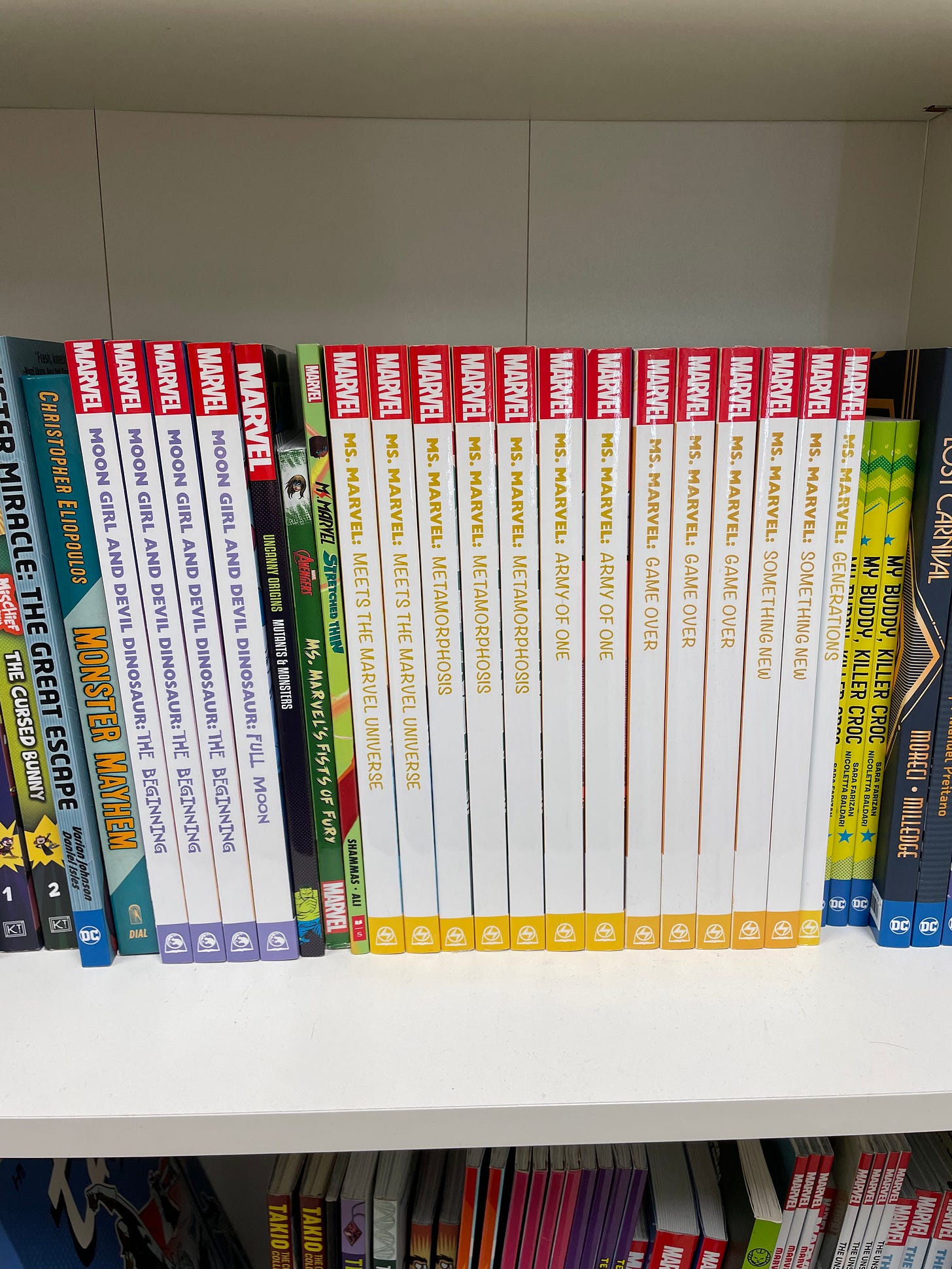
One of the worst offenders has to be Marvel’s in-house produced young adult line. Take a look at the spines of these Moon Girl and Ms Marvel books. What are the fonts on those subtitles?!
In stark contrast, you can see the Scholastic produced Ms Marvel graphic novel at the front of what Marvel has put out. It might not be the best design, but it works, and doesn’t look like someone took a crowbar to comic sans, and called it “fun”.
That does it for another week here. I’ll be spending a chunk of the weekend reading Ringmaster by Josie Riesman and finally watching Barbarian with my partner Danica. Then, we’re right back here on Monday for another fun week of content.
Talk with you soon.
-B.


