A few weeks back, our full time employee was looking through Previews and stopped on an image.
“Do you know about Hexagon Bridge?” he asked.
The name was familiar, but I couldn’t quite put my finger on it.
“Is it new?” I asked.
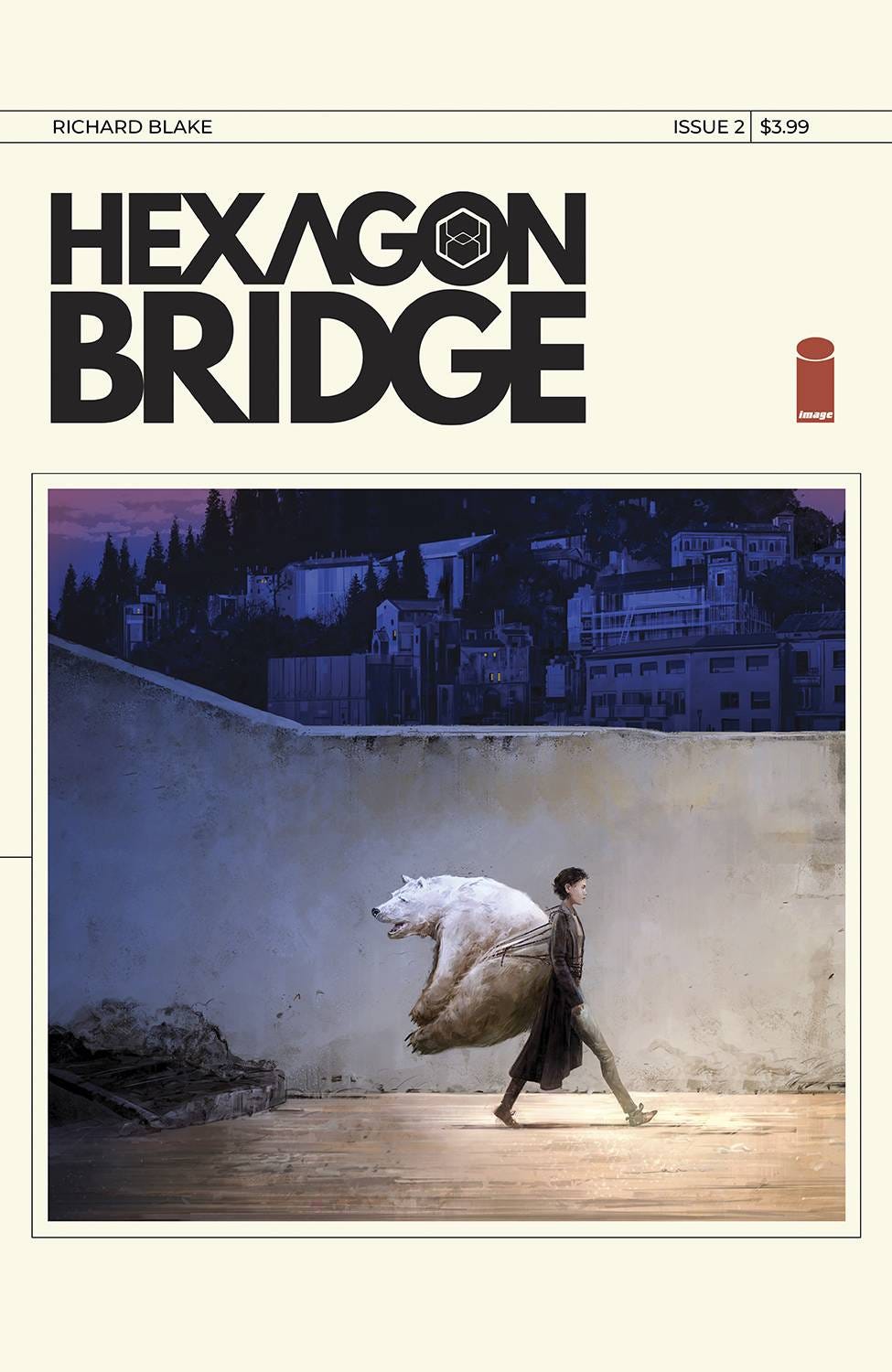
“It’s not out yet,” he replied, motioning for me to come over, “This is the cover to the second issue.”
Folks, its a good one. The only problem? I had already sent away initial orders for the first issue, and I had completely forgotten about the book.
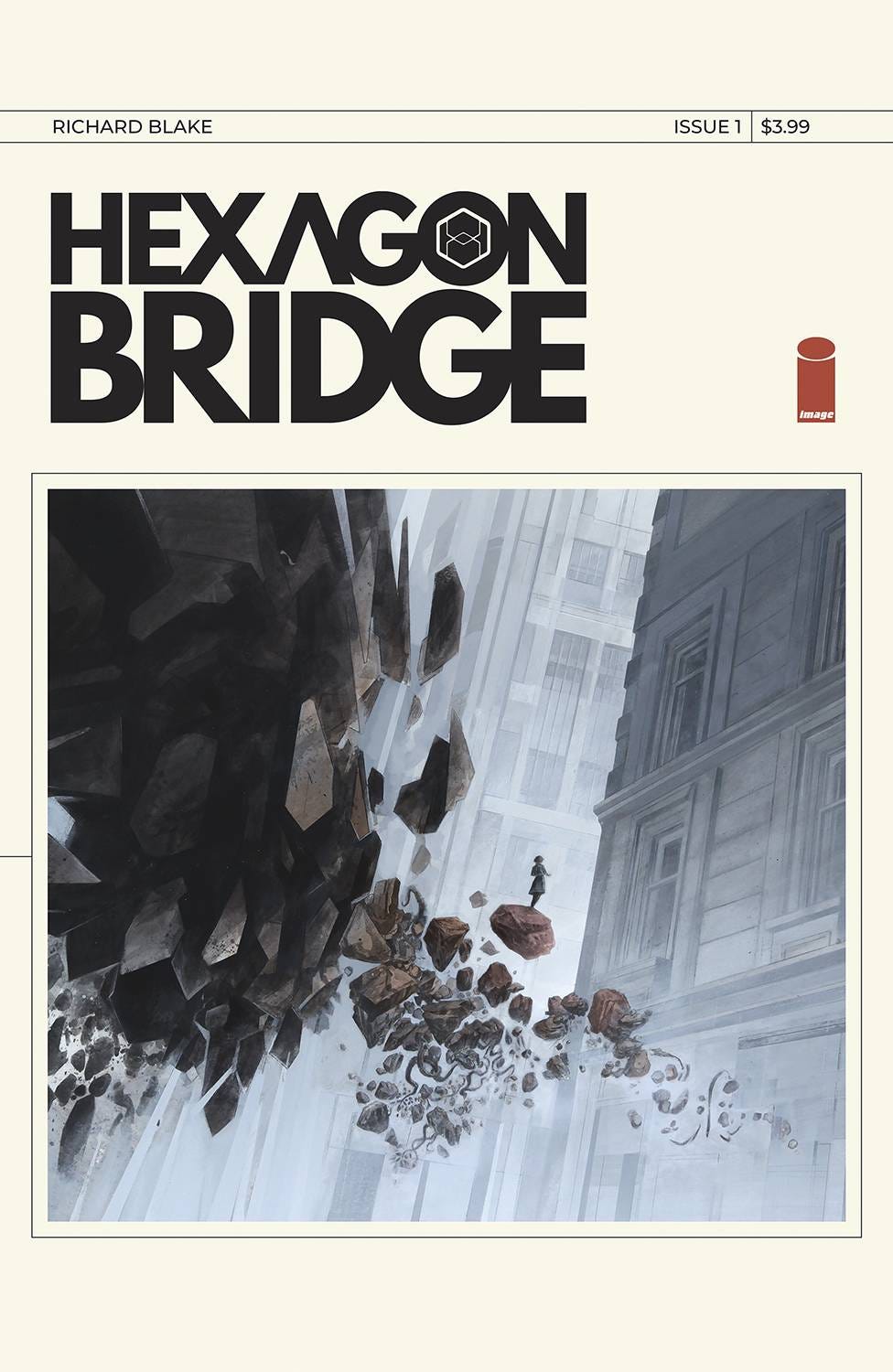
Now, before we get to the cover in question, I want to follow up on my post about “good” solicitations. Hexagon Bridge is another book that has a fine pitch for their first issue. The solicit text and the cover look like this:
Story & art by: Richard Blake
MINISERIES PREMIERE
Explorers Jacob and Elena Armlen find themselves trapped in a strange parallel dimension of elusive landscapes and shifting architecture inhabited by mischievous entities. Now it's up to their clairvoyant daughter Adley and sentient robot Staden to rescue them!
A perfectly fine bit of business that lays out the concept. The cover does a great job of reflecting the contents issue as well, with an effective and sparse design. But again, we’re just hitting “good” levels here.
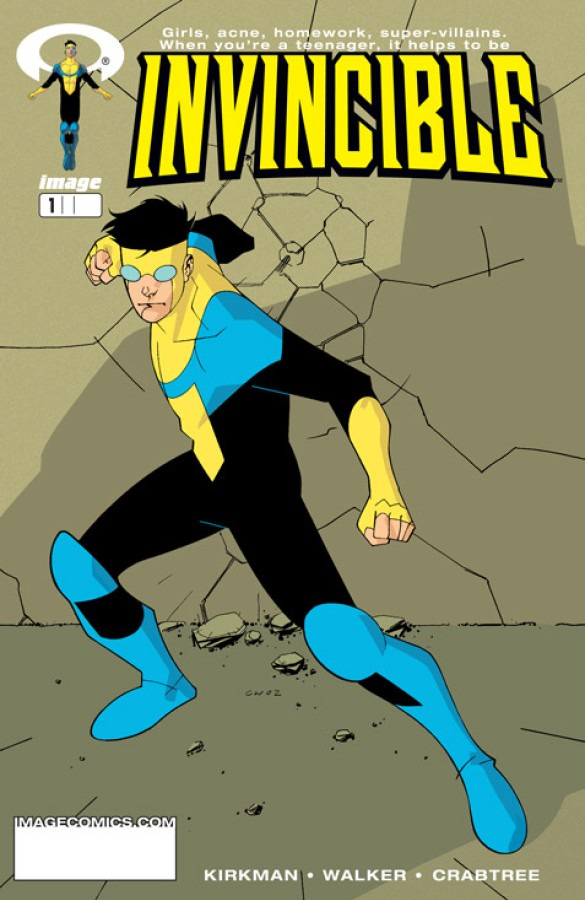
Wondering off to the side a bit, writer Kurt Busiek documented some of the reasons he skipped grabbing the first issue of Robert Kirkman and Corey Walker’s Invincible back in the day. A lot of this was captured in his introduction to the series’ first collected edition, where he said the concept and the cover didn’t grab him. Plus, there were a few different “superhero” style books Image had solicited to release in a chunk, leaving Invincible to fight for attention in its own line.
From his intro:
“Like the vast majority of smart-thinking Americans, I passed up Invincible #1 at least twice. Heard about the new Image “superhero line”, saw the books in the catalog, and breezed right by Invincible. Just another superhero book, I thought. I’ve got a complete run of Nova. Of Firestorm. Of Speedball. This isn’t anything I need.
…
“And then the books came out, and there I was in the comics shop, and there was Inivincible, and I passed it up again. Didn’t even pick it up and flip through it. Just another superhero cover, nothing special, don’t bother.”
He goes on to turn the narrative around, and extoll all the virtues of Invincible and the ways it differentiated itself from your typical superhero book. While it was pretty traditional, the flavour of the dish made it unique.
For reference, here’s how Invincible was first presented in solicits:
The Concept:
Mark Grayson is just like most everyone else his age. He's a senior at a normal American high School. He has a crappy part time job after school and on weekends. He likes girls quite a bit... but doesn't quite understand them. He enjoys hanging out with his friends, and sleeping late on Saturdays... at least until the good cartoons come on. The only difference between Mark and everyone else is that his father is the most powerful superhero on the planet, and as of late, he seems to be inheriting his father's powers. Which sounds okay at first, but how do you follow in your father's footsteps when you know you will never live up to his standards?
This Issue:
ORIGIN ISSUE!!! Strange things begin to happen to Mark Grayson as he begins to develop superpowers. Luckily, his dad is around to show him the ropes, at least he WOULD be if he weren't so busy saving the world all the time. Mark is forced to go out on his own, and try and figure out how all this superheroing business works. The results are a monumental disaster. Meanwhile, there's trouble at school, when Mark is drug into a fight of epic proportions. I dare you to miss it... well... not really... I'd prefer if you just bought it.
As Busiek implied, there wasn’t much to grab onto, both during his glance through the ordering catalog, and during trip to the comics shop. A kid is in high school and he’s starting to get powers. The family aspect mentioned, and is one of the tastes that eventually got Busiek hooked on the book, but the solicit and cover didn’t properly show off that flavour.
Elsewhere in his introduction, Busiek makes reference to offering different cover concept and copy to help the team sell their book. One of these suggestions was used for the book’s first collected edition, which looked like this:1
This cover clearly offers a lot more of the flavouring that made Invincible unique, driving the concept home a bit more. It is clearly a better take than the generic pose. Which brings me back to Hexagon Bridge.
Even though I had placed orders for the first issue (and will be placing my final orders for it this weekend), the book completely slipped my mind - just another sci-fi book about a young girl with missing parents. The art style on the cover did a bit to intrigue, but without anything more, I was more than likely to place a really tight order.
And then, this cover arrived.
I have questions about this cover. I want to know more about this cover. Where is this? Why is there a polar bear strapped to that young person’s back? Where are they striding to with such purpose, and why?
This, gives the book a flavour. This guarantees that I make the time to read whatever preview PDFs are sent my way before I have to order issue one. This also makes sure I check out issue two when I get the chance.
The trick then becomes: how do I sell folks on issue one? Our current tactic has been to just put the cover of issue two into people’s faces. Given my druthers, I would have popped it onto the first issue as it is clearly more grabbing. While the first issue’s cover does more accurately represent the book’s contents, folks aren’t going to discover the flavour until issue two arrives. They’ll be like Kurt Busiek, passing the story by in the catalog, and in the shop. This will not do.
It is vital these days that solicits and covers do more than exist. The torrent of product means you have to be up front with the bits that make your project different than the rest. Without it, you’re just going to get lost in the crush of it all.
Alright folks, that’s one week back on track, with hopefully many more to come. Join me again for three posts next week. Not sure when they’re be, but I’m sure they’re gonna’ happen.
Talk with you soon.
-B.
In current printings, this cover is on the back of the first collected edition.


The funny thing is I find issue one’s cover to be more impactful, because it was the first look I had at that cover design. I’m buying it because it’s so striking and the image leans into the mystery of it. I actually think polar bear backpack works well because it IS #2. It would be a super weird #1 cover to me, even though it is fun.
So glad you posted before issue 1 FOC. Gave me time to add it to my pull list!